You only get one chance at making a good first impression, and these days, that extends to your online presence as well. For most clients, the website will be the first point of contact they have with your law firm. Make sure it puts your law firm’s best foot forward with a professional design that attracts clients and establishes your firm as notable in the industry.
The Key Components of a Professional Website for Law Firms
The law firm website examples showcased here have these essential design elements.
High-Resolution Images
A picture is worth a thousand words, as the saying goes. We don’t want those words to fall into the realm of blurry, confusing, irrelevant, or outdated. The best legal websites have images of the highest quality, and they not only keep the client’s attention on the page but put the firm’s professionalism and expertise on full display.
Client-Focused Design
When designing a law firm website, keep the client’s needs in mind. What would you expect to see when searching for a lawyer? Know that you may not need to have the flashiest site. A clean, simple, and modern design that prioritizes ease of navigation and clear communication of your firm’s services and expertise is often the most effective approach. All of the five lawyer website examples listed below cater to the client’s expectations and needs.
Clear and Helpful Information
Make sure that clients don’t have to search too long and hard for things like customer testimonials and contact information. If your website is muddled with too much detail, the client may become overwhelmed or frustrated and click away. After all, you’re in the business of helping people, so start with your website!
Responsive Design
Ensure that your website translates well on all screen sizes and resolutions. In other words, it should be easy to read and navigate on mobile devices, tablets, and desktops.
Transform Your Law Firm’s Website with TitleTap
We specialize in designing websites tailored to the unique needs of law firms, ensuring your online presence reflects your expertise, professionalism, and commitment to clients
5 Examples of Well-Designed Law Firm Websites
The following lawyer website design examples check all the essential boxes mentioned above. Designed by our team at TitleTap, these sites are not only eye-catching but also ensure your law firm makes a solid impression the moment visitors open your page.
1. The Law Firm of Alexandre Ballerini 
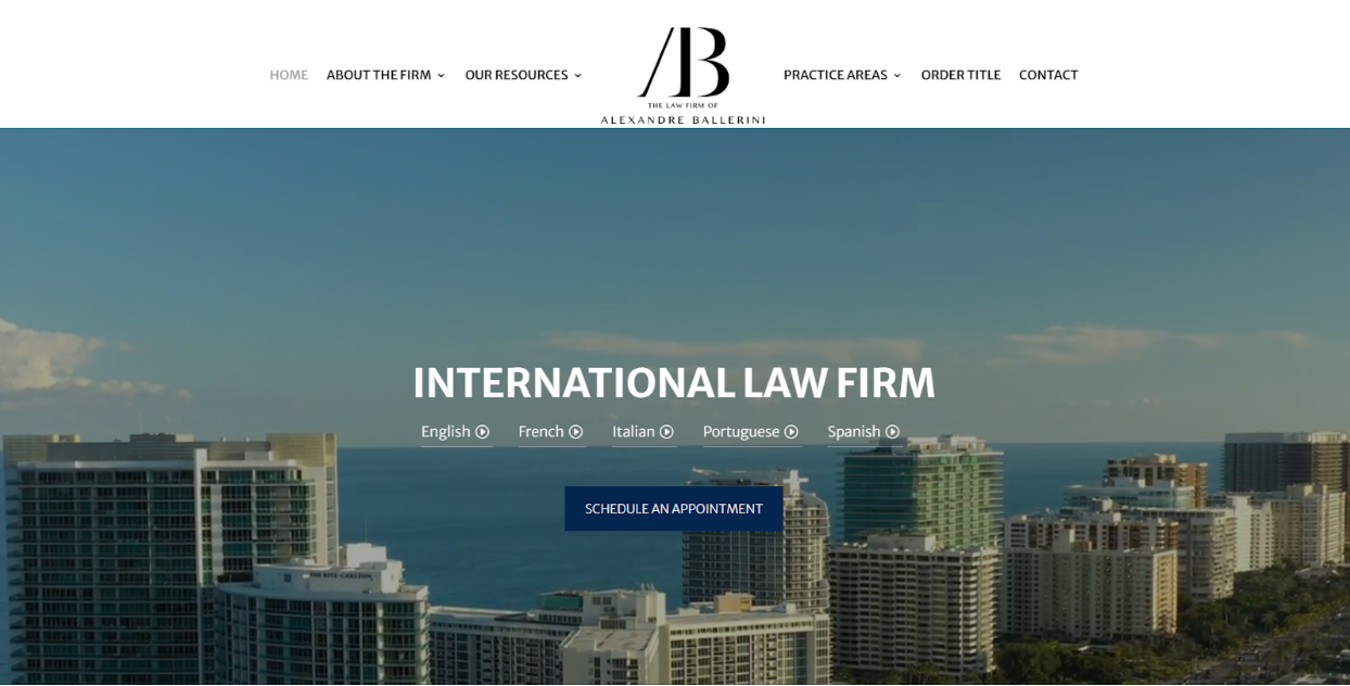
Take a look at the website for The Law Firm of Alexandre Ballerini, and you’ll see that this Miami attorney knows how to make a lasting first impression. A captivating video showcasing the Miami skyline welcomes visitors, with language options overlaying the scene to cater to diverse clientele needs.
Scrolling down reveals a dynamic graphic featuring the firm’s awards and achievements, as well as a few client testimonials. These effectively showcase their authority in the field of law. Additionally, a user-friendly navigation bar on this law firm website example makes it easy to explore their various pages, including their About page, resources, and areas of expertise.
And let’s not forget about their visual choices. The combination of fonts, for instance, infuses their website with elegance, while the use of high-resolution images speaks volumes about their professionalism, leaving no doubt about the quality of their services.
2. Lindenwoods Law Offices
Lindenwoods Law Offices embodies a “women for women” ethos, as shown on their website. An empowering image of women putting their hands together, with the slogan “Representing You When It Matters Most,” speaks to their mission of fighting for their clients, especially during tough times. Above it, a minimalist navigation bar allows for easy exploration of their website, including their core practice areas—family law, real estate law, and wills, trusts, and estates.
A “Contact Us” button is front and center, leaving no client questioning how they can secure more information about the firm. Scroll down further on the homepage, and you’ll find designated sections showcasing their practice areas, client testimonials, and the members of their team, each listed with their years of expertise.
3. June James Legal
June James Legal boasts a contemporary website, featuring a blue and white color palette that’s both visually appealing and reflective of the firm’s professionalism. Four prominent links at the top guide both new and existing clients to their site’s most important pages, while their practice areas can be easily navigated through a dropdown menu.
On the Intellectual Property Law page of this law firm website example, a brief explanation of IP law helps clients understand how June James Legal can assist them. A dedicated FAQs section expertly addresses common concerns potential clients may have, covering topics from types of IP law to copyright. Another client-focused design is the image of the Atlanta city skyline, which lets visitors know exactly where their firm is located.
4. NKG Law
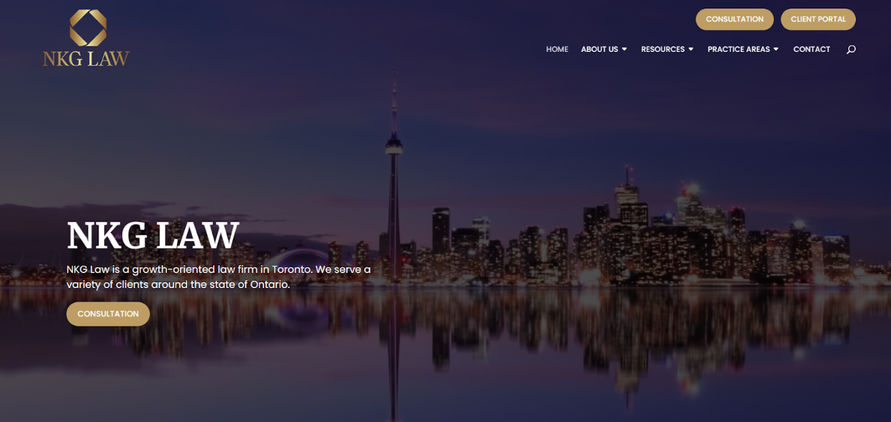
NKG Law excels in ensuring its clients have exactly what they need to gain more information or schedule a consultation. Below the hero image, the site visitor can find four separate boxes, each showcasing the firm’s three practice areas and contact information. Each box provides a brief overview of the service and is clickable, directing visitors to more detailed information. In terms of clear and helpful info for the client, this is it!
Further down the homepage, visitors can find a concise “Our Story” section, offering a glimpse into the firm’s genuine care for its clients. The “Contact Us” form, set against a striking contrast of black and gold, effectively grabs potential clients’ attention, encouraging them to connect.
5. Kelley, Grant & Tanis Real Estate Law Firm
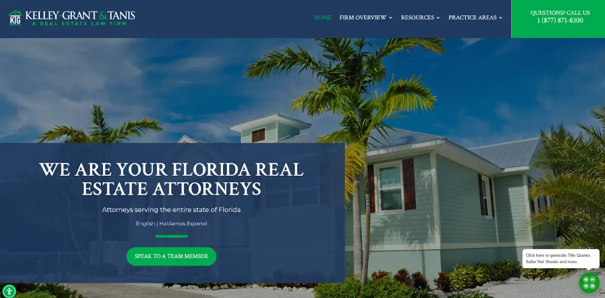
Kelley, Grant, & Tannis’s website is easy on the eyes with its cool green-and-blue color palette. It opens with an image of a residential property overlaid with the statement “We Are Your Florida Real Estate Attorneys.” This message, paired with the relevant visual, immediately conveys the firm’s focus—something that isn’t always obvious on law firm sites (except these law firm website examples, of course!).
Beneath the hero image are clickable icons of the firm’s main services, including creating a title quote, starting a new lease, and initiating an eviction. Further down, a contact form with the call-to-action (CTA) “Call Us!” prompts clients to reach out to the firm for more information.
Get Your Best Law Firm Website Design with TitleTap
As shown by these attorney website examples, creating a professional, customized website in the law firm space requires detailed and specialized knowledge of web design. A website that delivers what a prospective client is looking for and is easy to use can position your firm to stand out in the crowd, demonstrating professionalism in the field and landing clients.
Turn to TitleTap for turnkey law firm web design services—plus content marketing to further boost your online presence. Discover the difference our professional web design can make. Request a demo today!

Access Turnkey Law Firm Web Design with TitleTap
Turn to TitleTap for complete web design services and content marketing to elevate your online presence. See the difference our professional design can make.


